Mobile-First Indexing: What You Need to Know
Mobile-first indexing is not a mobile problem — it is an information-parity problem that happens to be scored on a phone. This pillar covers how the mobile index actually works, the Parity Stack (a five-layer audit model that tells you what to fix first), where parity breaks in real builds, and the technical checklist and audit cadence that keep it from regressing every sprint.


Mobile-first indexing is no longer a migration event. It is the permanent state of the index. Google declared the transition complete in October 2023, leaving only a small set of sites that fail on mobile entirely still crawled by the legacy desktop crawler. For everyone else, the smartphone rendering of your page is the only version that gets stored, evaluated, and ranked. Your desktop site is, for indexing purposes, decoration.
That has a blunt consequence most teams still haven't internalized: anything that exists only on desktop does not exist. Not "carries less weight." Does not exist. The 800-word explainer your mobile template collapses into a truncated teaser, the internal links buried in a desktop-only mega-menu, the FAQ schema your mobile build skips — Google never sees any of it.
This article covers how the mobile index actually works, where parity breaks in real builds, and a layered audit model you can run against your own site this week.
What Is Mobile-First Indexing?
Mobile-first indexing means Google crawls, renders, and indexes using the smartphone agent, and the resulting mobile rendering becomes the canonical representation of the page.
There is one index, not two. This is the first misconception worth killing: there is no "mobile index" sitting beside a "desktop index." Google said as much when it first announced the shift back in 2016 — the search index remains a single index, now built from mobile documents. Desktop searchers are served results derived from what the mobile crawler saw.

How Google's mobile index works
The pipeline is unchanged in structure — discovery, crawl, render, index, serve — but the client is different at every stage:
- Discovery happens through links and sitemaps found in the mobile rendering.
- Crawl uses the smartphone Googlebot user agent, subject to your robots directives.
- Render executes JavaScript in a headless Chromium via Google's Web Rendering Service at a mobile viewport. What the DOM contains after render is what counts, not what your HTML source contains.
- Index stores the post-render mobile content, links, and structured data.
- Serve ranks that stored representation for every query, on every device.
The render step is where most technical debt surfaces. Google's own JavaScript guidance notes that the rendering service may skip resources it judges non-essential and caches aggressively, so a component that lazy-loads on user interaction, a blocked resource, or a third-party script that times out at a mobile viewport can leave content absent from the indexed record. Nobody gets an error. The page just quietly ranks for less.
Why Google switched
The reason is boring and durable: the majority of searches happen on phones, and an index built from desktop renderings was describing pages that most users would never see. Google's original rationale was exactly this — its ranking systems were evaluating the desktop page rather than the one a mobile searcher actually landed on, which caused problems whenever the mobile version carried less content.
Read the motive, not just the mechanic. Google is not rewarding mobile as a virtue — it is eliminating a measurement error. That framing predicts future behavior better than "Google loves mobile" ever will.
Mobile-friendly is not mobile-first ready
These get conflated constantly, and the confusion is expensive.
- Mobile-friendly is a rendering-quality question: does the page work on a small screen? Legible text, tap targets, no horizontal scroll.
- Mobile-first ready is an information-parity question: does the mobile rendering contain everything Google needs to evaluate the page?
A site can be flawlessly mobile-friendly and catastrophically unready. A pared-down, gorgeous mobile template that strips 40% of the body copy and half the internal links passes every mobile-friendliness heuristic while destroying its own ranking substrate. Google is explicit that a mobile page carrying less content than its desktop counterpart should expect traffic loss, because there is simply less information to work with. The failure looks like a design win in every stakeholder review.
How Mobile-First Indexing Affects SEO
It doesn't change ranking factors — it changes the inputs
Mobile-first indexing did not introduce new ranking factors. Relevance, links, and quality signals work as they did. What changed is which copy of your page those factors are computed against.
That distinction matters for diagnosis. When rankings drop after a redesign, teams tend to hunt for an algorithm update. The more common cause is that the mobile template stopped carrying content or links that the desktop template carried, and the page is now being ranked on a thinner document. Same algorithm, less input.

Where the leaks actually happen
In practice, parity breaks in a handful of predictable places:
- Truncated body content behind "read more" patterns that fetch on click rather than render on load.
- Internal links dropped from mobile navigation, breadcrumbs, or related-content modules — reshaping internal PageRank distribution across the entire site.
- Structured data rendered only in the desktop template, or with different values.
- Metadata drift, where the mobile template generates different titles or descriptions.
- Images and media stripped or lazy-loaded in a way Googlebot never triggers.
The tabs-and-accordions exception
A persistent myth says content hidden behind tabs or accordions gets discounted. Google has repeatedly said the opposite for mobile pages: content collapsed for UX reasons but present in the HTML is indexed normally, because accordions are a legitimate response to small screens. Google's own best-practices doc goes further and recommends moving content into accordions or tabs instead of removing it when space is tight.
The line is DOM presence, not visual visibility. Collapsed and present: fine. Absent until an XHR fires on tap: invisible. One honest caveat: several SEO split tests have found pages perform better when important copy is surfaced rather than collapsed, so treat accordions as a UX tool for genuinely secondary content, not a place to bury the argument.
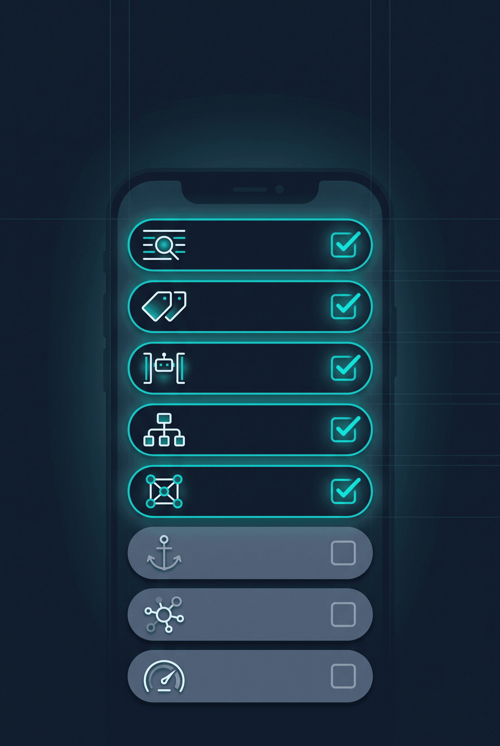
The Parity Stack: A Five-Layer Audit Model
Most mobile SEO checklists are flat lists, which is why they get worked in the wrong order. Teams optimize Core Web Vitals for a quarter while the mobile template is silently dropping half the page's internal links. The speed work is real. It is also worthless until the layer beneath it holds.
Parity is a stack. Each layer depends on every layer below it. Audit bottom-up, fix bottom-up, and never spend on a higher layer while a lower one is broken.
Layer 1 — Resource parity: can Googlebot render it at all?
Every CSS, JS, image, font, and API endpoint the mobile page needs must be crawlable and must return within a reasonable window. Blocked resources produce a partial render, and a partial render is indistinguishable from a thin page. Google's mobile guidance is unambiguous: don't block resources with robots.txt.
Decision rule: if a resource is required to paint or populate content, it cannot be disallowed. No exceptions for "we blocked /assets/ to save crawl budget." That trade is never worth it.
Layer 2 — Content parity: is everything there after render?
The full body copy, headings, and media present on desktop must be present in the mobile DOM after render. Collapsed is fine; conditional on interaction is not.
Decision rule: if removing content improves mobile UX, remove it from both templates or restructure it — don't fork the information architecture by device. A fork means you're ranking on the weaker fork.
Layer 3 — Link parity: does the mobile page distribute equity the same way?
Internal links in the mobile rendering define your site's crawl paths and internal link graph. Hamburger menus are fine — the links inside them are in the DOM. Desktop-only footers, sidebars, and related-post modules are not fine.
Decision rule: count internal outlinks on the mobile render versus desktop for your top templates. A material gap is a site-wide architecture problem wearing a page-level costume.
Layer 4 — Signal parity: do the machine-readable claims match?
Google asks for equivalent titles, meta descriptions, headings, and structured data across both versions. Structured data present on desktop but missing on mobile means the rich result eligibility is gone.
Decision rule: structured data should be generated from the same data layer as the visible content, not hand-maintained per template. Duplicated authoring is where drift is born.
Layer 5 — Experience parity: is the page fast and usable on a real phone?
Core Web Vitals, tap targets, readability, no intrusive interstitials. This layer is real, and it is last — because it is a refinement of a page that Google can already fully see. Speed improvements on an under-indexed page are optimization theater.
Decision rule: fix Layer 5 for users and conversion rate, and treat ranking benefit as secondary. That's an honest cost/benefit case that survives a CFO conversation. The ranking-only case usually doesn't.
The stack's value is prioritization under constraint. When you have one sprint, the model tells you where to spend it — and gives you the language to explain why the speed ticket is waiting.
Mobile SEO Best Practices
With the stack in mind, the tactical layer is straightforward.
Page speed and Core Web Vitals
Target LCP, INP, and CLS on field data, not lab scores. Lab tools model a device and a network; field data from the Chrome User Experience Report — surfaced in Search Console's Core Web Vitals report and PageSpeed Insights — reflects your actual traffic on actual phones. As Google's own INP guidance puts it, real-user data is the basis for assessing responsiveness, with a good INP landing under 200ms at the 75th percentile. Teams that optimize to a lab score routinely ship improvements that don't move the field distribution at all.
Note that INP replaced FID as the responsiveness Core Web Vital in March 2024, and it is meaningfully harder to pass. FID measured only the delay before processing began; INP measures the full interaction latency through to the next paint. Cloudflare's analysis of the transition found that a site scoring "Good" on FID may well score poorly on INP, precisely because INP exposes main-thread work that FID never counted. If your last CWV review predates that change, the numbers are stale.

The trade-off worth naming: aggressive JS deferral improves INP and LCP but can push content past the render snapshot if you defer too much. Speed and content parity pull against each other. Layer 2 wins.
Images
Serve modern formats, use responsive sizing, and set explicit dimensions to protect CLS. Google's mobile guidance also asks for high-quality images at stable URLs — constantly-changing image URLs prevent proper processing and indexing of the resource.
For deferral, Google's lazy-loading guidance is direct: load content when it enters the viewport using native loading="lazy" or the IntersectionObserver API, never on a user action — and verify in the URL Inspection tool that the content actually appears in the rendered HTML. Custom scroll-triggered JavaScript is the failure mode; a headless crawler may never fire it.
Navigation, readability, and interstitials
Tap targets should be comfortable at speed, not just legal. Body text should be readable without pinch-zoom. On overlays, Google's position is that intrusive interstitials and dialogs obstruct content and hurt search performance, with exemptions for legally mandated cases like age gates and cookie notices. Your newsletter modal is not exempt — and independent of Google, entry overlays are among the most reliable ways to destroy mobile conversion rate.
Responsive Design and Mobile-First Indexing
Why responsive is the recommended default
Google recommends responsive web design for a structural reason, not an aesthetic one: it's the easiest pattern to implement and maintain, and it means one URL, one HTML payload, one set of signals. Parity becomes a property of the architecture rather than a discipline the team has to sustain. Notably, Google's mobile-first best-practices guide applies mainly to dynamic serving and separate-URL setups — with responsive design, content and metadata are identical by construction. Every alternative makes parity an ongoing maintenance obligation, and maintenance obligations lose to roadmap pressure.

Separate mobile URLs (m.example.com)
Separate mobile URLs still work if configured correctly — canonical from mobile to desktop, rel="alternate" from desktop to mobile, equivalent content and structured data on both. Google's guidance for m-dot sites reads like a bug list drawn from experience: error-page status must match across versions, mobile URLs must not rely on fragments, and desktop pages that redirect to the mobile homepage will fall out of the index entirely.
The problem isn't that it can't be done. It's that "configured correctly" has to stay true through every release, forever, across two codebases. The industry consolidated away from m-dot for good reason: major publishers and retailers who ran m-dot properties migrated to responsive largely to eliminate a class of parity bugs that kept costing them organic revenue. If you're still on m-dot, the migration is usually justified by maintenance cost alone, before any SEO argument.
Under mobile-first indexing, the m-dot content is the indexed content. Your desktop site is the alternate now, whatever your rel tags say about canonical intent.
Dynamic serving
Dynamic serving returns different HTML from the same URL based on the user agent. Google strongly recommends the Vary: User-Agent header in this configuration, both to signal caching servers and as a crawling signal. It is legitimate and occasionally necessary — but it is the most fragile of the three, because parity depends on two rendering paths staying aligned and on caching layers respecting that header. CDN misconfiguration here can serve desktop HTML to a mobile crawler or vice versa, and the failure is invisible from a browser.
Use it only when responsive is genuinely infeasible, and instrument it: fetch your key templates with a smartphone user agent on a schedule and diff against desktop.
Common responsive mistakes
- Hiding content with display: none at mobile breakpoints because it "clutters the layout." The content stays in the DOM and is indexed, so this is safer than a fork — but if it matters enough to index, it usually matters enough to show.
- Shipping the desktop-weight JS and image payload to phones and calling it responsive. Responsive layout is not responsive delivery.
- Breakpoint-driven navigation that drops link groups entirely rather than reorganizing them.
Technical SEO Checklist for Mobile-First Indexing
Run this against your top templates — home, category, product/service, article. Not every URL; the templates.
- Mobile crawlability. Fetch each template with a smartphone user agent. Confirm 200 status, full render, no blocked resources.
- Metadata identity. Titles, descriptions, and robots meta match across renderings. Google specifically warns against noindex tags or blocked resources on the mobile version.
- robots.txt. No disallow rules covering CSS, JS, image, or API paths required for render.
- XML sitemaps. Canonical URLs only, accurate lastmod, no m-dot leakage.
- Structured data. Present on the mobile rendering with identical values; validate on the mobile URL, not the desktop one.
- Canonicals and hreflang. Self-referencing canonicals on responsive URLs. Hreflang clusters must point to mobile-indexable equivalents and be reciprocal.
- Link count. Internal outlinks on mobile render greater than or equal to desktop for each template.
- Core Web Vitals. Field data passing on the mobile origin, segmented by template group.
On Search Console's mobile usability report
A note that corrects a lot of stale advice: Search Console's Mobile Usability report, the Mobile-Friendly Test, and its API were all retired as of December 1, 2023. Google's position was that mobile usability still matters as part of page experience guidance, but better evaluation tools had emerged — pointing site owners to Lighthouse. If your process still says "check the mobile usability report monthly," that process is broken and has been quietly returning nothing.
The replacement stack is the Core Web Vitals report in Search Console, Lighthouse, and the URL Inspection tool's rendered-HTML view — which remains the single most useful mobile-first diagnostic Google ships, because it shows you loaded resources, console exceptions, and the DOM Googlebot actually indexed. Most teams never open it.
Common Issues and How to Fix Them
- Rankings drop after a redesign, but the content looks fine in your browser. Cause: content missing from the mobile render. Fix: URL Inspection, read the rendered HTML, diff against the desktop DOM.
- Slow mobile loads despite good lab scores. Cause: lab vs. field mismatch. Fix: optimize to CrUX field data, segmented by template.
- Pages indexed thin with no obvious cause. Cause: blocked CSS, JS, or images. Fix: audit robots.txt against every render-required path.
- Deep pages dropping out of the index. Cause: mobile navigation dropped internal links. Fix: restore link parity in the mobile templates.
- Rich results disappeared. Cause: structured data is desktop-only or has drifted. Fix: generate schema from a shared data layer.
- Traffic holds but conversions fall. Cause: interstitials, tap targets, readability. Fix: fix it for users; ranking benefit is secondary.
The pattern across all of these: the browser lies to you. A developer checking on a phone sees a working site, because a phone runs JavaScript on demand and waits for slow resources. Googlebot does neither with the same patience. Always diagnose from the rendered HTML Google stored, not from your device.

How to Audit for Mobile-First Readiness
A repeatable pass, in stack order:
- Render check (Layer 1–2). URL Inspection on each key template. Read the rendered HTML. Diff word count and headings against desktop. This single step catches the majority of real damage.
- Crawl with a smartphone user agent (Layer 1–3). Run a JS-rendering crawler with a mobile UA, then compare its output to a desktop-UA crawl: URL count, word count per URL, internal link count.
- Signal diff (Layer 4). Extract titles, descriptions, canonicals, hreflang, and schema from both crawls. Any delta is a bug.
- Field vitals (Layer 5). Search Console Core Web Vitals, segmented by template group. Confirm against CrUX.
- Device spot-check. Real phones, throttled network. Tap targets, interstitials, navigation depth.

Ongoing maintenance
Parity degrades. It degrades every sprint, because the people shipping templates are not the people reading Search Console.
- Mobile-UA crawl diff: monthly, or after any template release.
- Rendered-HTML spot check on the top five templates: per release.
- Field CWV review: monthly.
- Full stack audit: quarterly.
The highest-leverage move is putting the mobile-UA crawl diff into the release process rather than into someone's monthly checklist. Parity bugs are cheap to prevent at deploy and expensive to find three months later, after the rankings have already moved and the redesign is off the roadmap.
The Takeaway
Mobile-first indexing is not a mobile problem. It is an information-parity problem that happens to be scored on a phone. The teams that stay ahead of it aren't the ones with the fastest sites — they're the ones whose mobile rendering is a complete, faithful record of the page, every release, without anyone having to remember.
Run the Parity Stack bottom-up. Fix what Google can't see before you optimize what it can.